I made some minor CSS tweaks on mostly spacing here that have bothered me since the beginning (though not enough to get me to fix them until now, hehe).
This is extreme minutiae and probably doesn’t even warrant a note here but I did spend over an hour working on this so I feel like I have to document it. (I woke up at 5 am and couldn’t sleep so I journaled and internetted for a while before deciding to fire up the old cascading stylesheet.)
(Sidenote: how did we ever design/build websites without Inspect Element??)
Anyway, the things that bothered me were (1) spacing was a little too tight between the top of the page and the header/navigation, (2) emoji to toggle light/dark mode were not properly vertically aligned, (3) superscript footnote links were pushing the lines out of whack, (4) superscript footnote links were inheriting the dotted bottom border which looked messy when the text itself was also linked, (5) on mobile, the note title, date, and body were uncomfortably crowded.
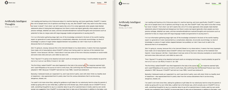
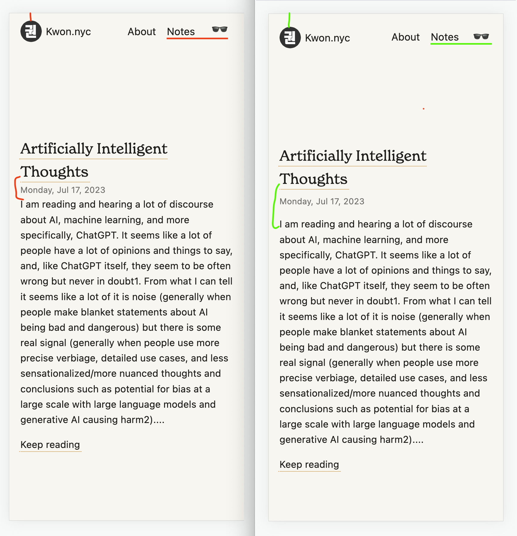
Mobile
(Sometimes I wish I had gotten a design degree or a computer science degree instead of a medical degree, and I do distinctly remember having that fleeting thought before deciding on the path that I did, because I really loved making websites, and I remember thinking, “Well, I guess it’s easier to be a surgeon who dabbles in some design on the side than a designer who dabbles in operating on the side.” Turns out I’m kinda both and neither?)
(A cleverer title for this post coulda been “Dr Pixel Pusher,” like Dr Pimple Popper)